Dashboards
CIPPCD 2025: Dynamic Reproducible
Documents for Public Policy with Quarto
Hello!

Navigation Bar and Pages

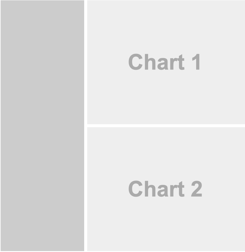
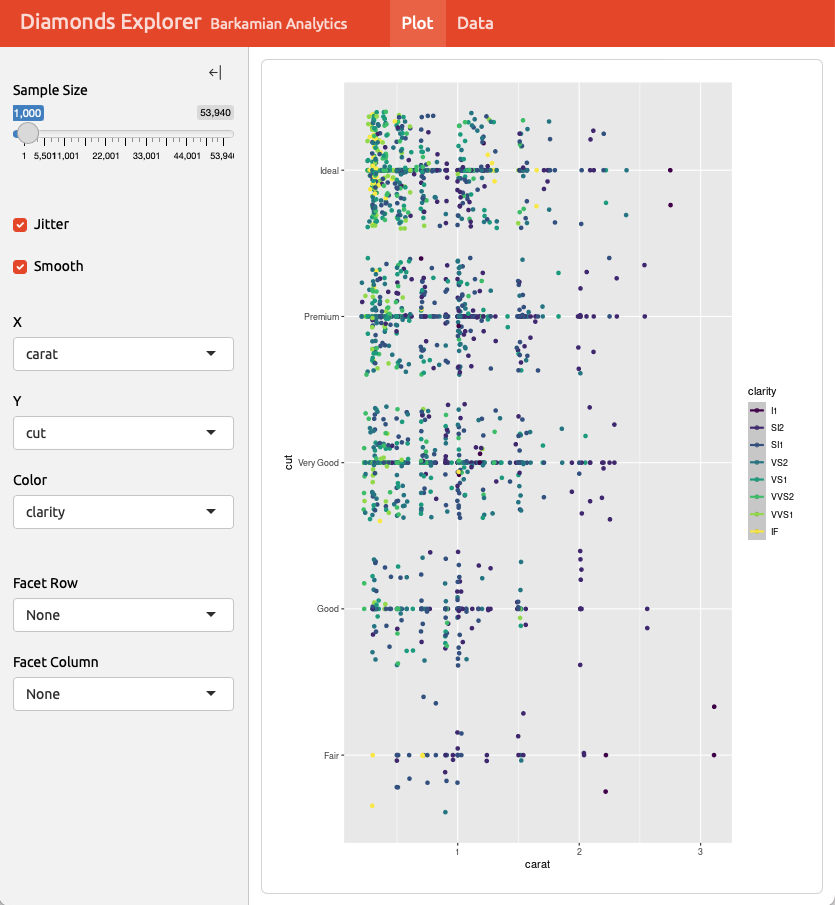
Sidebars: Page Level
Sidebars: Global
Layout: Rows
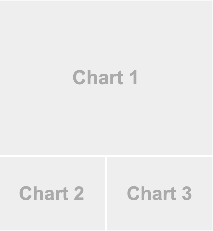
Layout: Columns

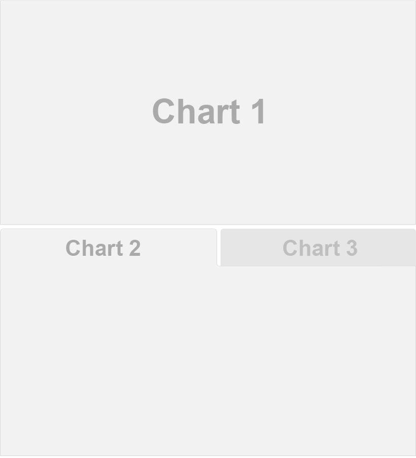
Tabsets
Plots
```{python}
#| title: GDP and Life Expectancy
import plotly.express as px
df = px.data.gapminder()
px.scatter(
  df, x="gdpPercap", y="lifeExp",
  animation_frame="year", animation_group="country",
  size="pop", color="continent", hover_name="country",
  facet_col="continent", log_x=True, size_max=45,
  range_x=[100,100000], range_y=[25,90]
)
```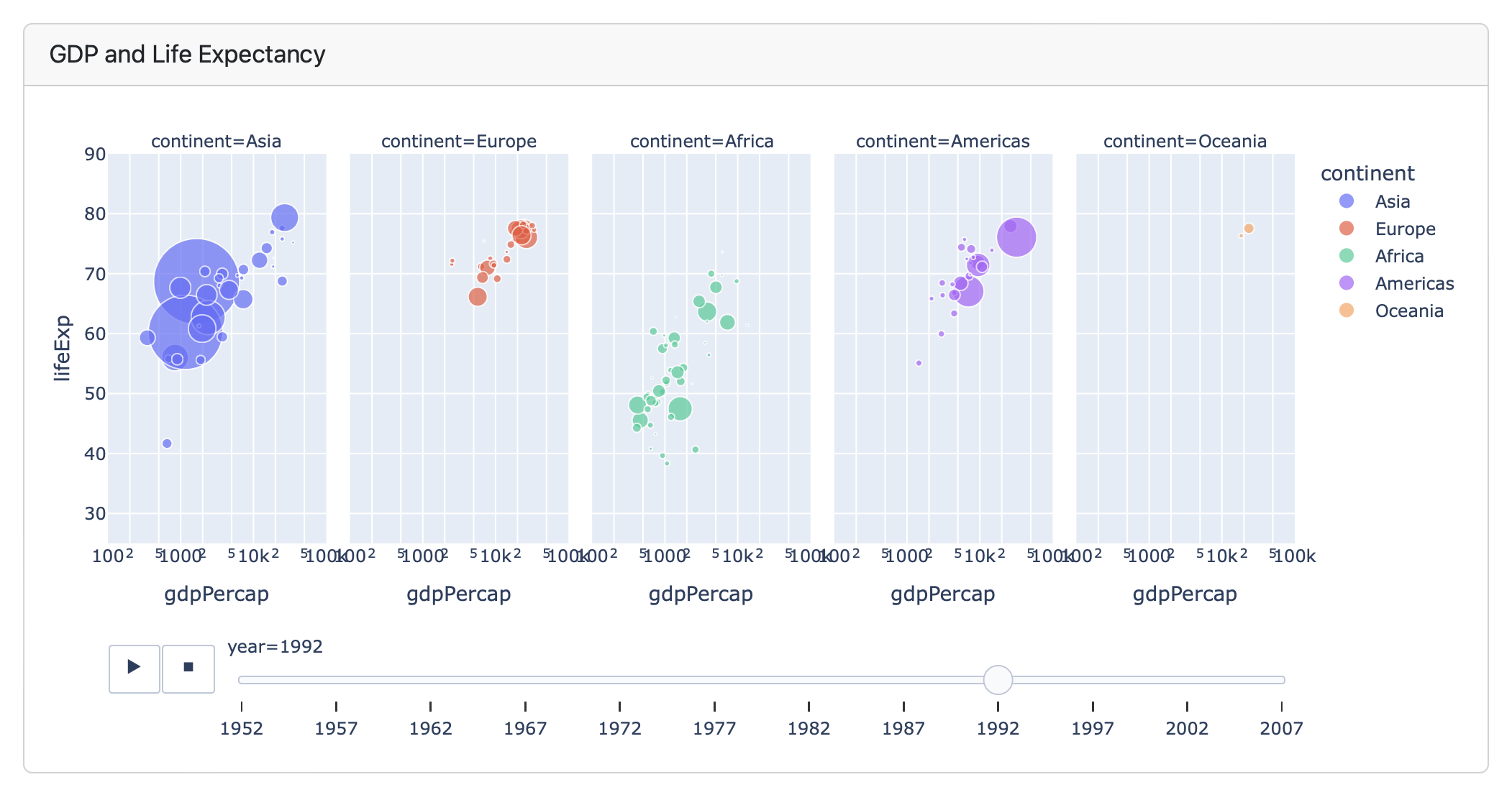
Plots
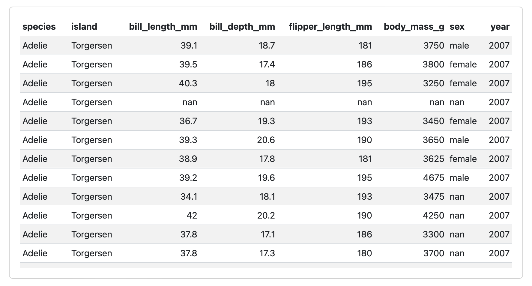
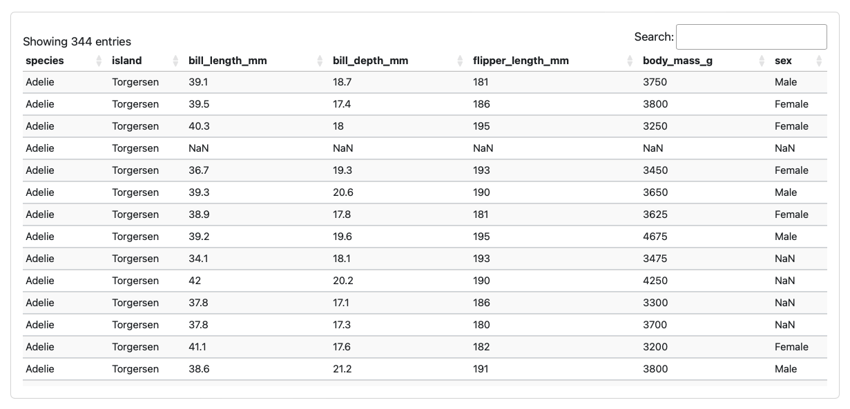
Tables
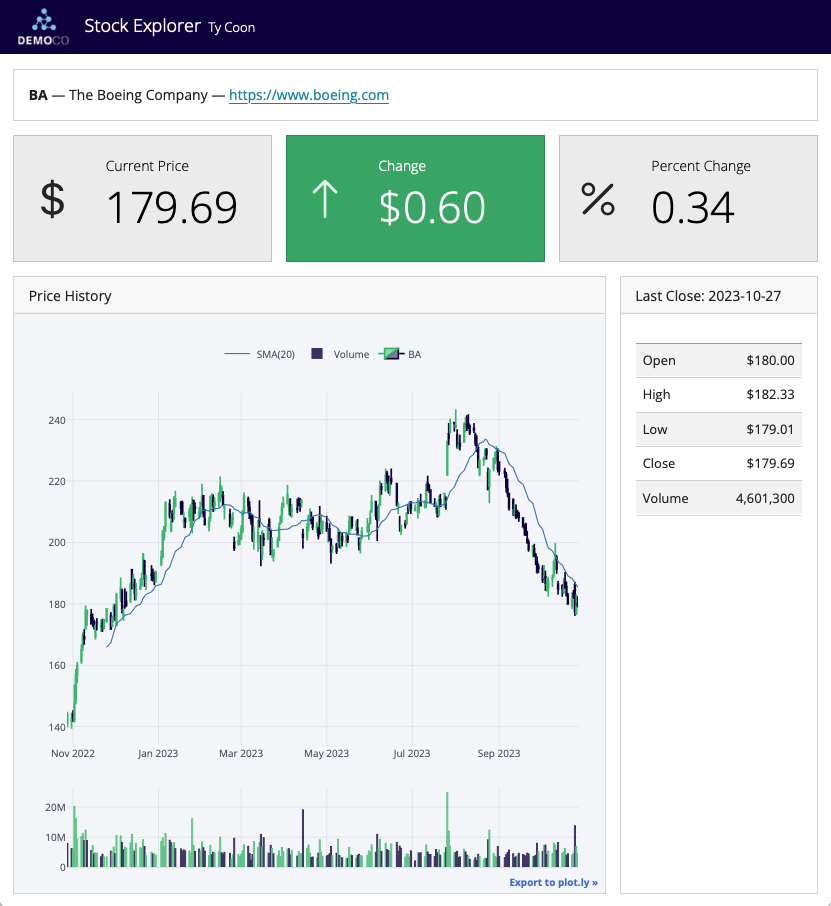
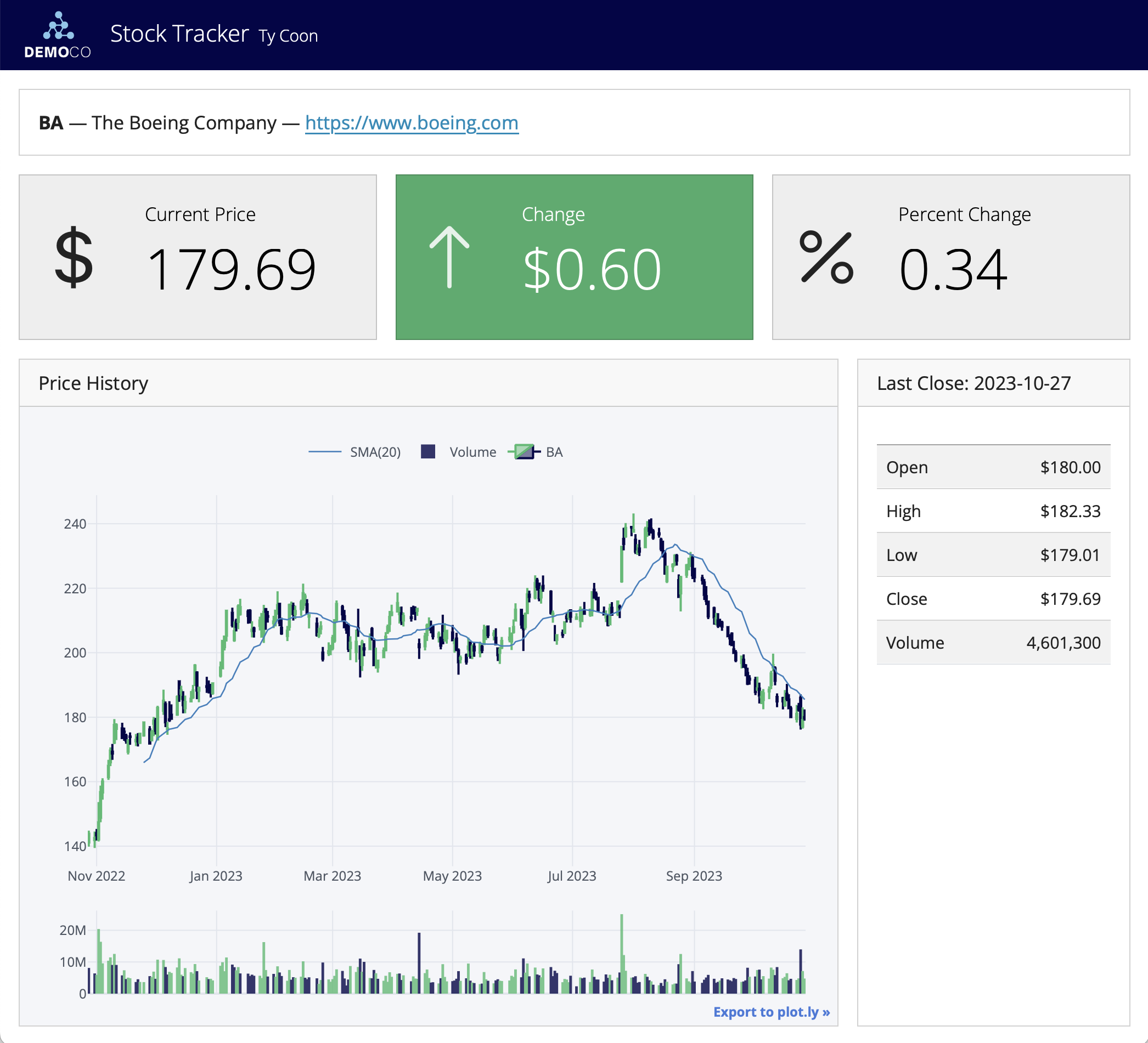
Value Boxes
## Row

```{python}
#| component: valuebox
#| title: "Current Price"
dict(icon = "currency-dollar",
     color = "secondary",
     value = get_price(data))
```

```{python}
#| component: valuebox
#| title: "Change"
change = get_change(data)
dict(value = change['amount'],
     icon = change['icon'],
     color = change['color'])
```
Text Content
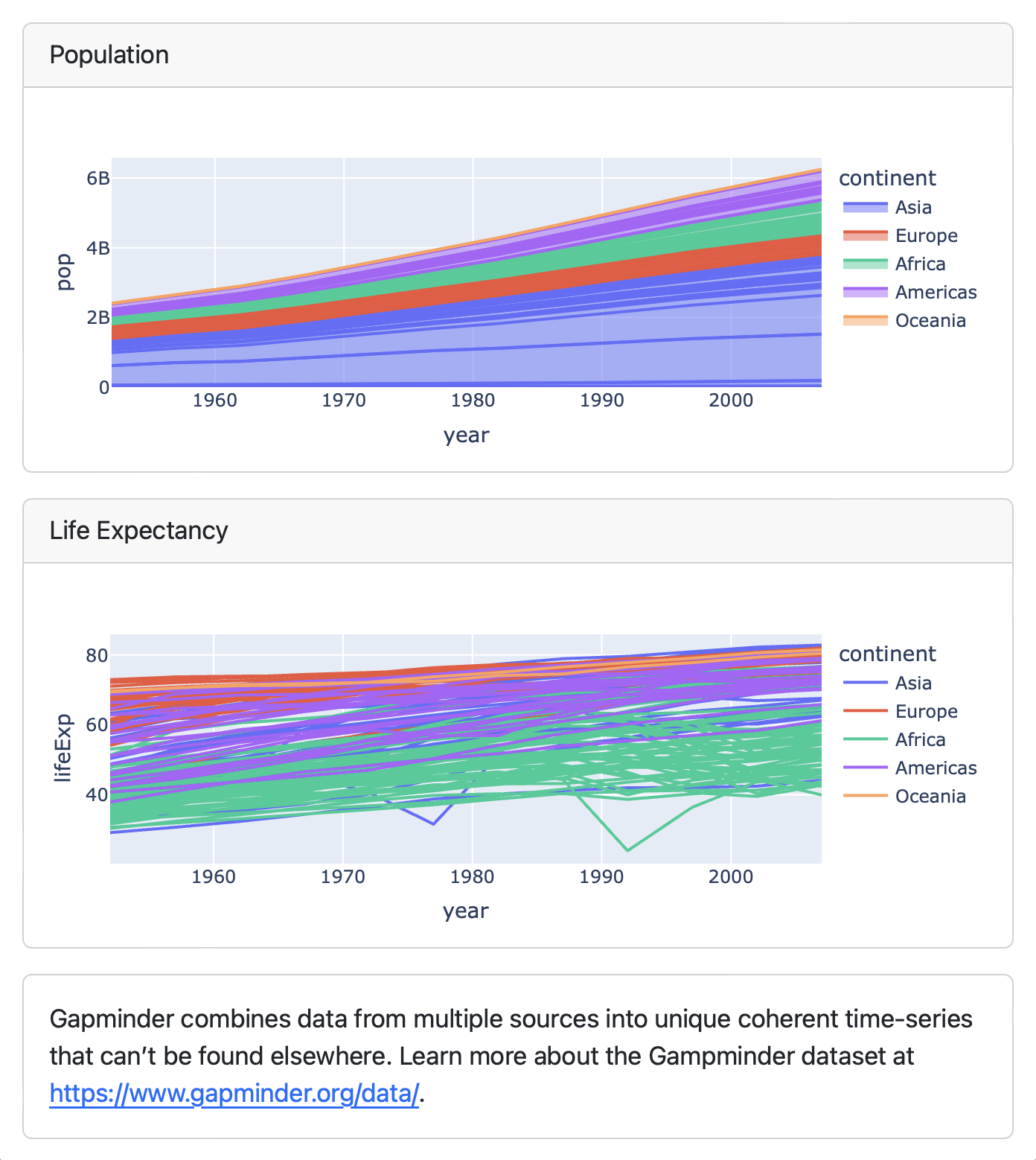
## Column

```{python}
#| title: Population
px.area(df, x="year", y="pop",
        color="continent",
        line_group="country")
```

```{python}
#| title: Life Expectancy
px.line(df, x="year", y="lifeExp",
        color="continent",
        line_group="country")
```

::: {.card}
Gapminder combines data from multiple sources
into unique coherent time-series that can’t be
found elsewhere. Learn more about the Gampminder
dataset at <https://www.gapminder.org/data/>.
:::
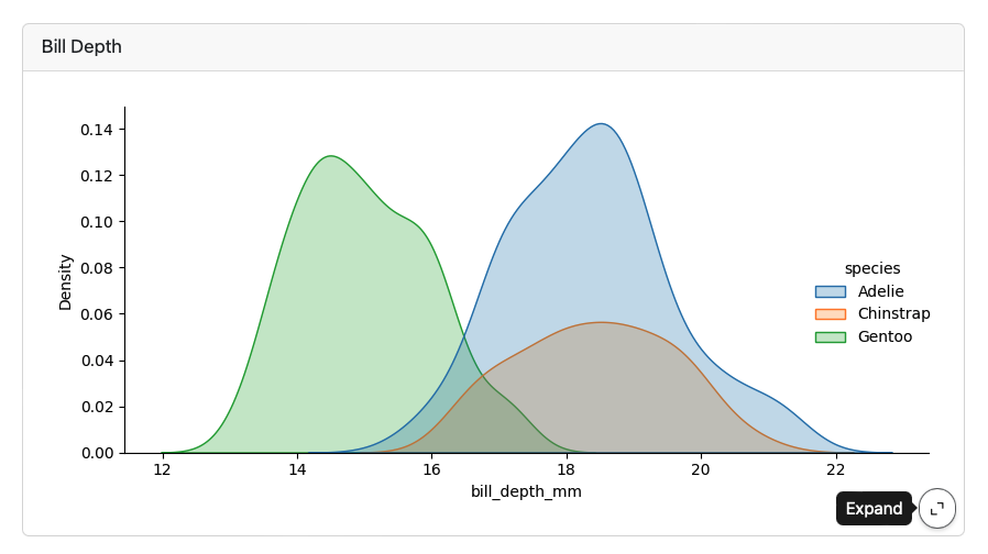
Expanding Cards
Cards provide an Expand button which appears at bottom right on hover:
Parameterized Dashboards
Add a parameters tag to the first cell (based on papermill) :
Use the -P command line option to vary the parameter:
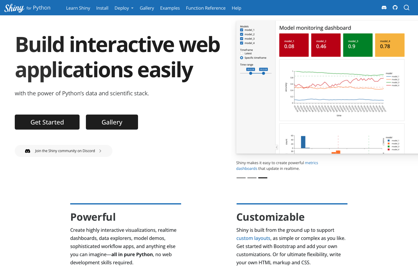
Interactive Dashboards
https://quarto.org/docs/dashboards/interactivity/shiny-python/
For interactive exploration, some dashboards can benefit from a live Python backend
To do this with Quarto Dashboards, add interactive Shiny components
Deploy with or without a server!
Thanks!