United Nations Voting Correlations
David Robinson
2026-03-09
Source:vignettes/united_nations.Rmd
united_nations.RmdHere we’ll examine an example application of the widyr package,
particularly the pairwise_cor and
pairwise_dist functions. We’ll use the data on United
Nations General Assembly voting from the unvotes
package:
## # A tibble: 869,937 × 4
##     rcid country            country_code vote
##    <dbl> <chr>              <chr>        <fct>
##  1     3 United States      US           yes
##  2     3 Canada             CA           no
##  3     3 Cuba               CU           yes
##  4     3 Haiti              HT           yes
##  5     3 Dominican Republic DO           yes
##  6     3 Mexico             MX           yes
##  7     3 Guatemala          GT           yes
##  8     3 Honduras           HN           yes
##  9     3 El Salvador        SV           yes
## 10     3 Nicaragua          NI           yes
## # ℹ 869,927 more rows
This dataset has one row for each country for each roll call vote. We’re interested in finding pairs of countries that tended to vote similarly.
Pairwise correlations
Notice that the vote column is a factor, with levels (in
order) “yes”, “abstain”, and “no”:
levels(un_votes$vote)## [1] "yes" "abstain" "no"We may then be interested in obtaining a measure of
country-to-country agreement for each vote, using the
pairwise_cor function.
library(widyr)

cors <- un_votes |>
  mutate(vote = as.numeric(vote)) |>
  pairwise_cor(country, rcid, vote, use = "pairwise.complete.obs", sort = TRUE)

cors
## # A tibble: 39,800 × 3
## item1 item2 correlation
## <chr> <chr> <dbl>
## 1 Slovakia Czechia 0.989
## 2 Czechia Slovakia 0.989
## 3 Lithuania Germany 0.978
## 4 Germany Lithuania 0.978
## 5 Lithuania Estonia 0.975
## 6 Estonia Lithuania 0.975
## 7 Lithuania Latvia 0.973
## 8 Latvia Lithuania 0.973
## 9 Slovakia Slovenia 0.972
## 10 Slovenia Slovakia 0.972
## # ℹ 39,790 more rowsWe could, for example, find the countries that the US is most and least in agreement with:
US_cors <- cors |>
  filter(item1 == "United States")

# Most in agreement
US_cors
## # A tibble: 199 × 3
## item1 item2 correlation
## <chr> <chr> <dbl>
## 1 United States United Kingdom 0.575
## 2 United States Canada 0.570
## 3 United States Israel 0.546
## 4 United States Australia 0.514
## 5 United States Netherlands 0.513
## 6 United States Luxembourg 0.504
## 7 United States Belgium 0.498
## 8 United States Italy 0.470
## 9 United States Japan 0.462
## 10 United States France 0.459
## # ℹ 189 more rows
# Least in agreement
US_cors |>
  arrange(correlation)
## # A tibble: 199 × 3
## item1 item2 correlation
## <chr> <chr> <dbl>
## 1 United States Belarus -0.331
## 2 United States Cuba -0.313
## 3 United States Czechoslovakia -0.275
## 4 United States Egypt -0.262
## 5 United States Russia -0.261
## 6 United States Syria -0.261
## 7 United States India -0.241
## 8 United States Afghanistan -0.191
## 9 United States Iraq -0.189
## 10 United States Indonesia -0.188
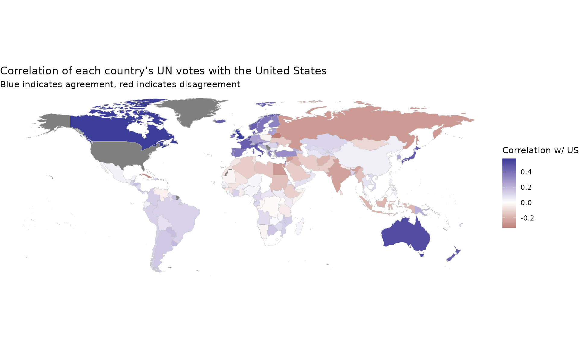
## # ℹ 189 more rowsThis can be particularly useful when visualized on a map.
if (require("maps", quietly = TRUE) &&
    require("fuzzyjoin", quietly = TRUE) &&
    require("countrycode", quietly = TRUE) &&
    require("ggplot2", quietly = TRUE)) {
  world_data <- map_data("world") |>
    regex_full_join(iso3166, by = c("region" = "mapname")) |>
    filter(region != "Antarctica")

  US_cors |>
    mutate(a2 = countrycode(item2, "country.name", "iso2c")) |>
    full_join(world_data, by = "a2") |>
    ggplot(aes(long, lat, group = group, fill = correlation)) +
    geom_polygon(color = "gray", size = .1) +
    scale_fill_gradient2() +
    coord_quickmap() +
    theme_void() +
    labs(title = "Correlation of each country's UN votes with the United States",
         subtitle = "Blue indicates agreement, red indicates disagreement",
         fill = "Correlation w/ US")
}
Visualizing clusters in a network
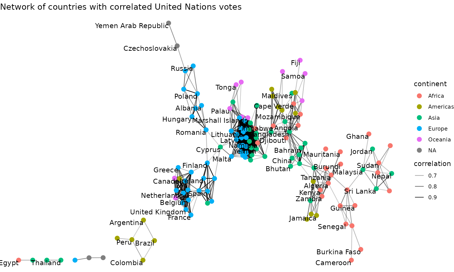
Another useful kind of visualization is a network plot, which can be created with Thomas Pedersen’s ggraph package. We can filter for pairs of countries with correlations above a particular threshold.
if (require("ggraph", quietly = TRUE) &&
    require("igraph", quietly = TRUE) &&
    require("countrycode", quietly = TRUE)) {
  cors_filtered <- cors |>
    filter(correlation > .6)

  continents <- tibble(country = unique(un_votes$country)) |>
    filter(country %in% cors_filtered$item1 |
             country %in% cors_filtered$item2) |>
    mutate(continent = countrycode(country, "country.name", "continent"))

  set.seed(2017)

  cors_filtered |>
    graph_from_data_frame(vertices = continents) |>
    ggraph() +
    geom_edge_link(aes(edge_alpha = correlation)) +
    geom_node_point(aes(color = continent), size = 3) +
    geom_node_text(aes(label = name), check_overlap = TRUE, vjust = 1, hjust = 1) +
    theme_void() +
    labs(title = "Network of countries with correlated United Nations votes")
}
Choosing the threshold for filtering correlations (or other measures of similarity) typically requires some trial and error. Setting too high a threshold will make a graph too sparse, while too low a threshold will make a graph too crowded.